Color Theory for Your Home
Feb 16, 2023
Color is everywhere, omnipresent, and gives our environment character and intrigue. Color is perceived with the RGB cells in the human eye, while the rod cells help to inform contrast and black and white visual information. Both types of cells work together to help us understand visual information, which is why some artists have successfully achieved optical illusions with color-block paintings when pairing the same colors within different tones. This is most explicitly apparent in the work of Joseph Albers, who explains in his book titled Interaction of Color the concept of the Bezold effect. This is a type of optical illusion that occurs when a single color is placed against two different colors, causing it to appear differently.

Visual perception occurs through the intersection of light with the functions of the human eye. Light is a function of the electromagnetic spectrum, which is the particle distribution of massless photons along a wavelength path at varying frequencies. We are capable of receiving the electrical signals of light within a visible range of approximately 380nm – 740nm wavelengths. These wavelengths activate the transmitters of visible information from the retina and fovea through cone and rod cells to the optical nerve that carries the signal to our brain, which then translates the signal into perception. Without these specific wavelengths of light, we really cannot perceive visual information. Natural daylight carries the full spectrum of electromagnetic wavelengths and always provides the most robust quality of light possible. The visible spectrum also enables color information through pigments or material structures that absorb, transmit, and reflect different wavelengths.
The visual information in our environment plays a large factor in our mindset. Colors have different effects on our psychology and state of mind. In many cases, the psychology of color is influenced by a combination of cultural norms and personal experiences. However, I will share the information that is specific to the wavelengths of light and their respective energy bands to provide some insight on how color may influence our moods. Along the electromagnetic spectrum, the wavelengths of light are from 380nm to 740nm, with longer wavelengths having lower energy bands or lower frequency. At the 380nm end of the spectrum, energy levels are more intense, and the visible colors include violet, indigo, and blue. In the middle range of the visible spectrum are the green wavelengths. As we near the upper end of the spectrum we find the yellow, orange, and red wavelengths of light with lower frequencies.
Our brainwaves function at different frequencies as well. Certain wavelengths of light will send the receptor signals to your brain to cause different brainwave energy. This is where the psychology of color comes in to play. Blue colors tend to induce lower brainwave frequencies, while red colors will induce higher brainwave frequencies. This helps to explain why blue tones provide calming and restful effects while red tones give a feeling of warmth and excitement.

It is also helpful to imagine the types of electromagnetic energy on either end just outside of the visible spectrum. Below 380nm we will have ultraviolet wavelengths and then X-ray, each of which have extremely high frequencies and high energy bands. Above 740nm we have infrared wavelengths and then radio waves, each of which have low frequency and low energy bands. Some near-infrared (or near-IR) can still be somewhat intense in energy band and most all of the infrared wavelengths we sense as thermal heat although we cannot see IR with the naked eye. So, based on this understanding of the physics of light and corresponding energy levels, we can infer the relative intensities of colors that we see within the visible range.
However, it is important to clarify the distinction of the two types of visible color – pigment color vs. structural color. Pigment color is found in most everyday objects and is a function of the chemical properties of the material composition. This is most obvious with paints that we might use on our walls and ceilings. Structural color occurs in otherwise clear or transparent materials when the wavelengths of visible light refract through the material. This is most obvious in prisms, glass, and in natural elements like butterfly wings and peacock feathers. When we see the color white, all wavelengths of visible light are being reflected from the object, so it appears to be ‘colorless.’ When we see the color black, all wavelengths of visible light are being absorbed by the object and so it might also appear ‘colorless.’

In pigment color objects, when we see the color red, for example, the red wavelength of light (around 720-740nm) is being reflected and all other visible wavelengths are being absorbed. When we see the color red in structural color objects, the red wavelength is either being refracted and stretched out for us to see or it is being reflected by the material structure while all other wavelengths are being absorbed or directly transmitted through the object. We may associate the color red with a sense of warmth as the higher energy bands of light are being absorbed with higher temperature equivalents. When we see the color blue or purple, the visible wavelength with the highest energy band is being reflected, and thus the wavelengths absorbed by the object are on the lower energy band and lower temperature spectrum, perhaps giving us a sense of coolth. The colors we see are inherently a function of the energy levels of light that we are experiencing.

When we experience pigment colors, the source of light plays a role in the way the color is perceived. This is especially important to consider when selecting color to paint the interiors or exteriors of your home, as the quality of light exposure for specific surfaces will result in slightly different color readings. With full spectrum daylight from the sun, we will have the purest color value reading of the pigment. However, when surfaces are in the shade or indoors, the pigment can appear quite different. Interior light fixtures each have different color spectrum emission values, which can be deciphered from the specifications on packaging when the bulbs are purchased. Fluorescent bulbs emit peaks in the green and yellow bands, while white LED bulbs have peaks in the blue spectrum. The light source can skew the appearance of pigment surfaces as it will either increase or reduce the available color spectrum that will be absorbed and reflected.
Ultimately, selecting colors for home spaces becomes a somewhat personal taste based on how you feel with different color schemes. Techniques for developing color options in design are often based on the rules of color theory. Color theory dictates primary colors (red, yellow, blue) and secondary colors (orange, green, purple) can be paired based on the opposing resolutions. This means that red pairs well with green (since green is a combination of yellow and blue), yellow pairs well with purple (a combination of red and blue), and blue pairs best with orange (a combination red and yellow). These pairings are identified as complimentary colors. In addition, color theory also sets up rules of harmony with colors through the principles of analogous colors (similar adjacent tones to the primary color on the color wheel), and monochromatic colors (one color with a range of tones or shades).
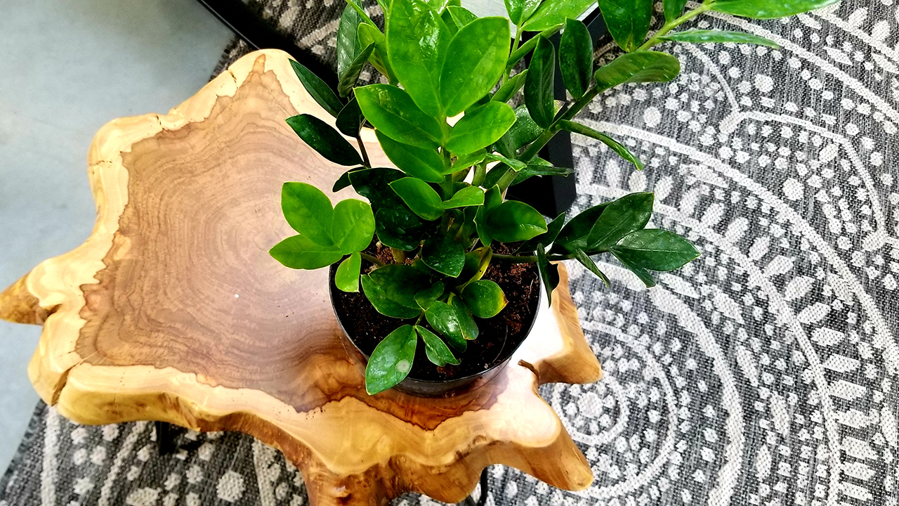
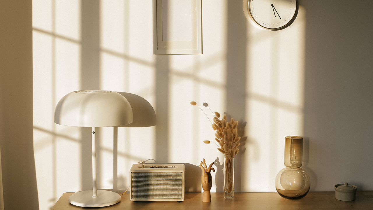
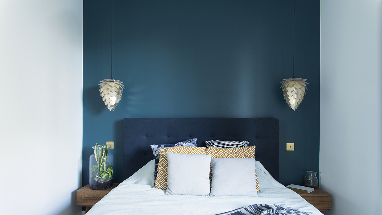
Neutral palettes are popular because of the muted tones and absence of too much color, providing a baseline environment that won’t overstimulate brain activity. Darker colors, including blues and purples, are helpful for bedrooms and rest spaces, while brighter tones, like yellows and greens, are beneficial for social spaces like living rooms. For me, I have a great appreciation for the colors of nature and enjoy the sense of bringing the outdoors inside through color schemes. This can change based on the season and the regional natural setting. When I lived in the Sonoran Desert, the bright greens and blues of cacti and clear skies were nice accent colors for indoor spaces. Where I am living now, in the forest setting of the Catskill Mountains, darker greens and browns tend to compliment the natural colors of the outdoor fir trees and pinecones. Nature brings a sense of peace and helps me to be grounded in the place I am dwelling, which is why the colors from nature provide the right palette for well-being inside the home.
If you have any questions about the most effective color-based design strategies for you and your home, reach out to AIDA, LLC today for a consultation. You can always find more information and healthy home resources at Aletheia Ida Design and Architecture, LLC (AIDA, LLC) at www.aletheiaida.com.